The contents of this lesson are Confidential.
Failing to Lose Support
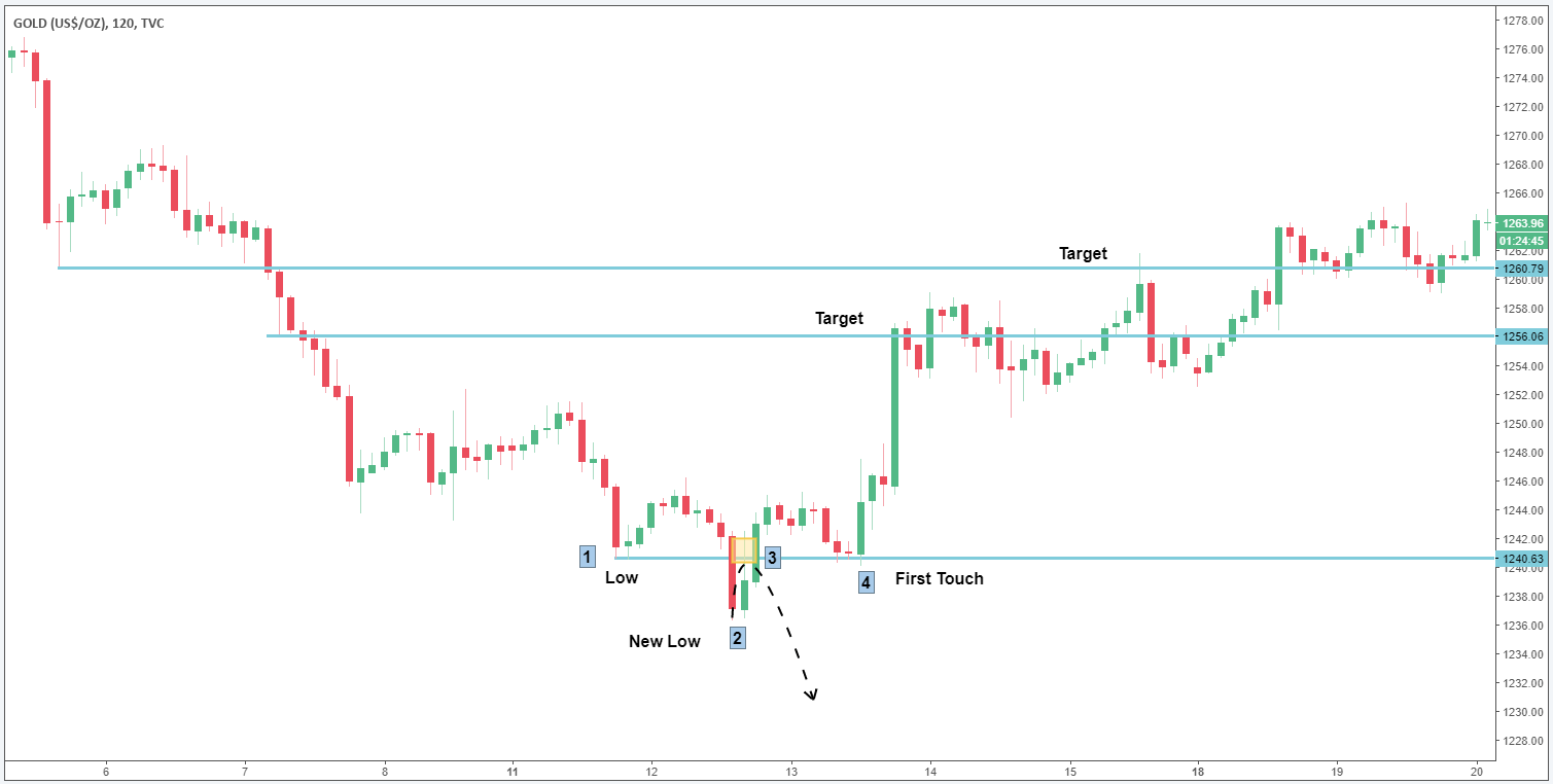
As you might have guessed, failing to lose support is the inverse of failing to gain. As I’ve said before, all markets essentially do the same things over and over. Similar to “failing to gain support”, “failing to lose support” happens about as often: 10% of the time. In the example below, price makes a low at point 1. Price then makes a new low at point 2 and should have smacked back down at point 3, designated by the black dotted arrow. I drew the dotted arrow to express the idea of what the trend would have been expected to do if the trend were to continue downward. Because price failed to lose support at point 3, it is then considered gained. Price eventually gets back above the low at point “1,” and eventually retraces back down to the price point “4″. At this moment, a trade should be taken long at the first touch of support at point “4,” with targets of prior support lost (also arbitrarily designated in the chart for you). A stop would be placed just below the low at point “2″, where price would invalidate the trend reversal. Remember: failing to lose support = support gained and should be traded as such.
I also want to add something that may or may not look familiar to you, depending on your study thus far. I briefly touched on patterns in earlier lessons, and you may have noticed that failing to lose support looks very similar to a bottoming Head and Shoulders (HnS) pattern.
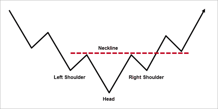
Notice the pattern is very similar to the chart I drew, but there’s a key difference in how I analyze the pattern and how typical traders recognize the pattern using flawed, regurgitated technical analysis found all over the internet. The key difference is that the typical trader focuses on the pattern and an established neckline, whereas I focus on the logic behind the pattern, and where the price fails to lose support to continue a downtrend.
What does Wikipedia have to say?
Importance of neckline
The drawn neckline of the pattern represents a support level, and the assumption cannot be taken that the Head and Shoulder formation is completed unless it is broken and such breakthrough may happen to be on more volume or may not be. The breakthrough should not be observed carelessly. A serious situation can occur if such a break is more than three to four percent. When a stock drifts through the neckline in small volume, there may be a wave up, although it is not certain, it is observed, that the rally normally does not cross the general level of the Neckline and before selling pressure increases, the steep decline occurs and prices tumble with greater volume. -Wikipedia
You see, the neckline… an arbitrary level of support that really plays no specific role in how I trade by itself, yet loads of traders who have learned about “Head and Shoulders” patterns focus on the neckline, simply because an online source tells them to do so. Also notice how these types of traders would wait for price to break the neckline before entering the trade, while I would have already been long the trade at the first touch of support gained, which we’ve now established as failed to lose, and is also the same level as the ‘right shoulder’ in the Wikipedia HnS example.
I prefer to trade with understanding instead of “waiting on confirmation” as many online sources would have you do, which causes you to miss many great scalping opportunities.